The goal of an artist's monograph is to show off a particular body of work and the appropriate critical writings of that work. But, for all their visual acumen, artists tend to favor the container model of their monograph: a clean presentation of their work without any "frippery" to get in the way of their expression.
Example
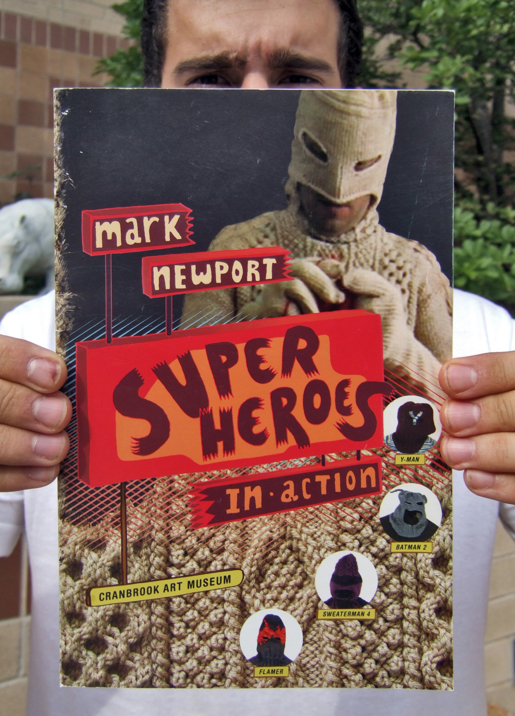
For an Artist, such as Mark Newport, what does one do when the reason and inspiration for the work comes from a visually rich history such as Comics and Comic Books. I sought, in my design and art direction of his Monograph to highlight and celebrate the seemingly low-brow imagery of the comic and reference the historical typographic and metaphoric elements those books draw from.

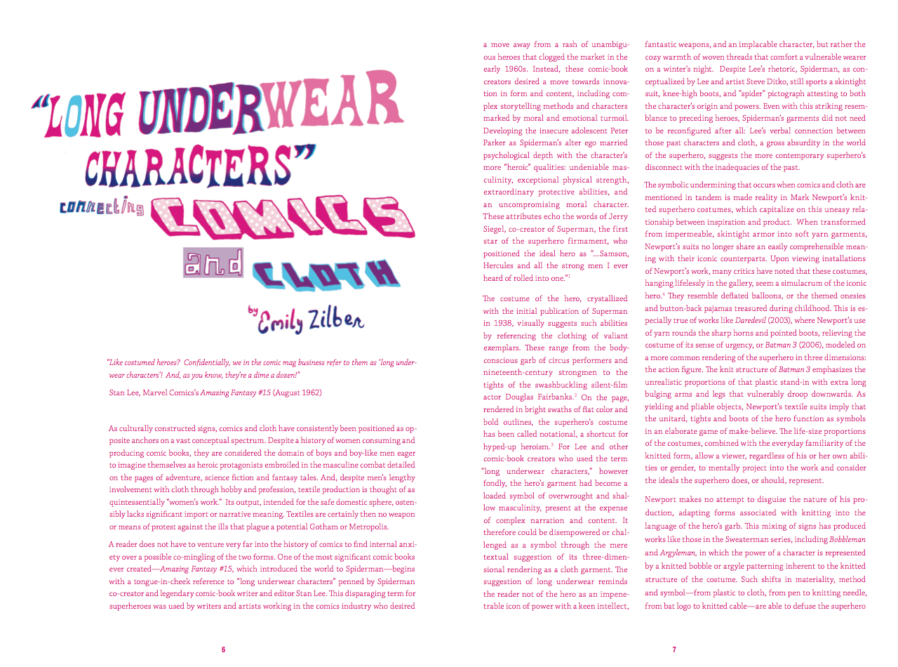
Comic books, being pulpy and disposable, were often limited in their color and printing choices and narrowing down the palette to a Cyan and Magenta evokes and using Victorian-inspired, in- your-face lettering for the headings of sections call back to both the form of the comic book and to advertising, "big- budget" aspect of type in a static medium.
Example

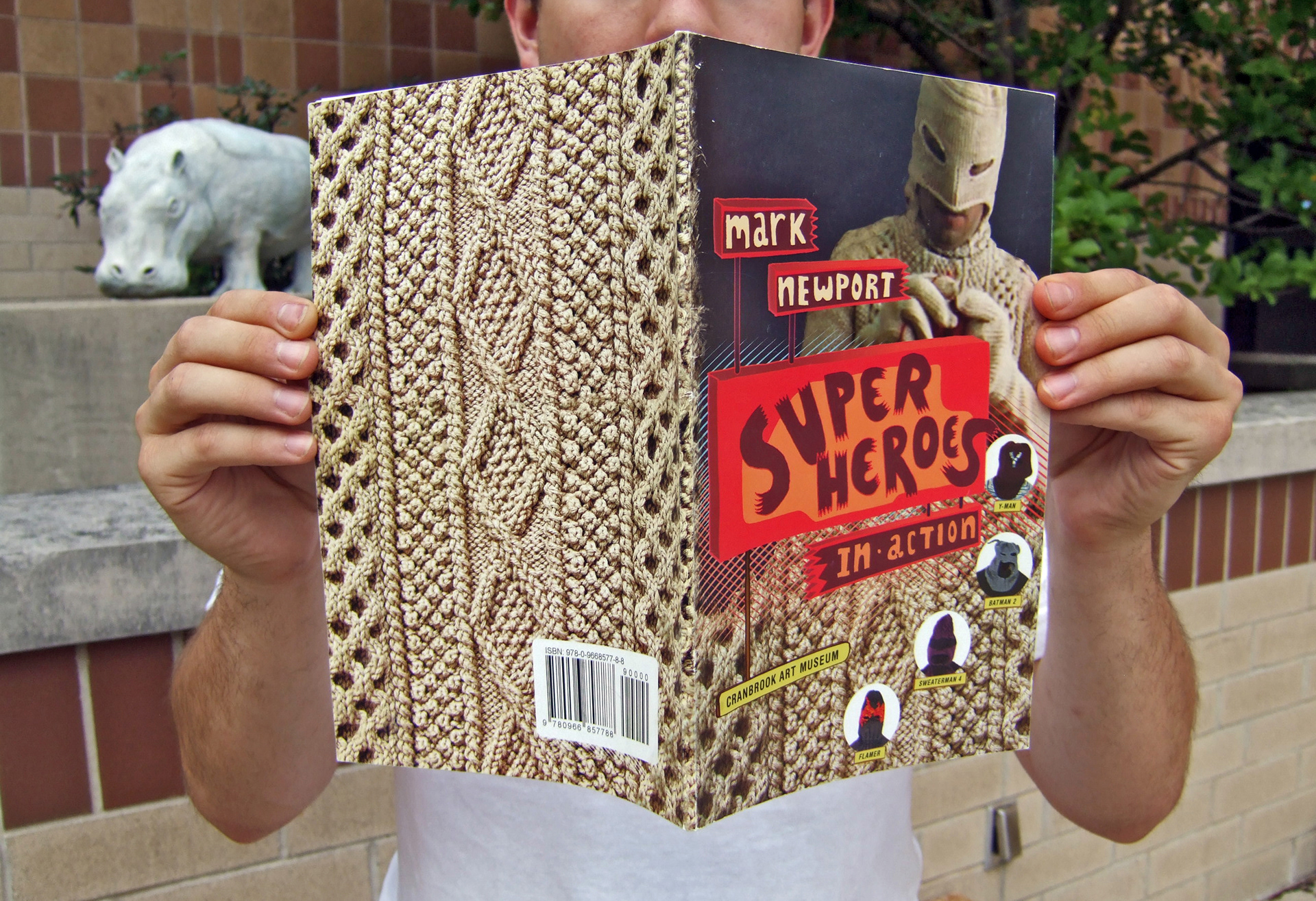
If I wanted to to break free of a typical Artist Monograph, I had to involve the artist in the process to a degree beyond "supplier of the work." As the division between the physical space and the digital space becomes blurred, what can we do to recreate the experience of the work in various media? Newport's work is highly tactle, and thus a cover should give you both a content-driven introduction to the work, but also a sensory introduction. The Artist weaves their own narrative through the process of work and we the audience rip the curtain, the sheet that separates us.

The costumes, by hanging on hooks, suggested to me a flayed body reminiscent of Michaelangelo's skin from the Last Judgement. Floppily, like discarded snakeskins, costume cast off, I got to thinking of how ever hero has a rogue’s gallery. The artist, by creating his work and giving form to his avatars/foes, assumes their form and power. There is often a lot of deeper thought one can give to the iconography of the Superhero in culture, as evidenced by our increased fascination with Marvel, DC and other fantasy-driven power beings since 2008.
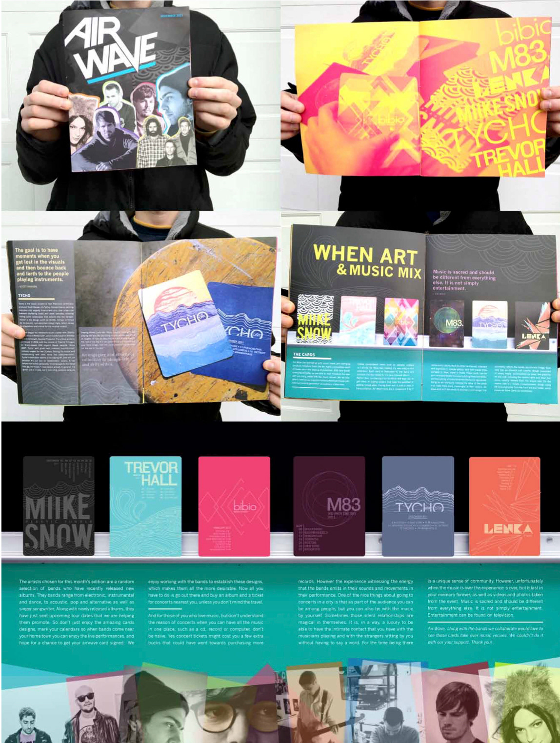
I've successfully carried this over into the page layout classes I have taught by encouraging students to find a sympathetic eye towards a subject and its design by finding appropriate solutions to a problem.
Student Work
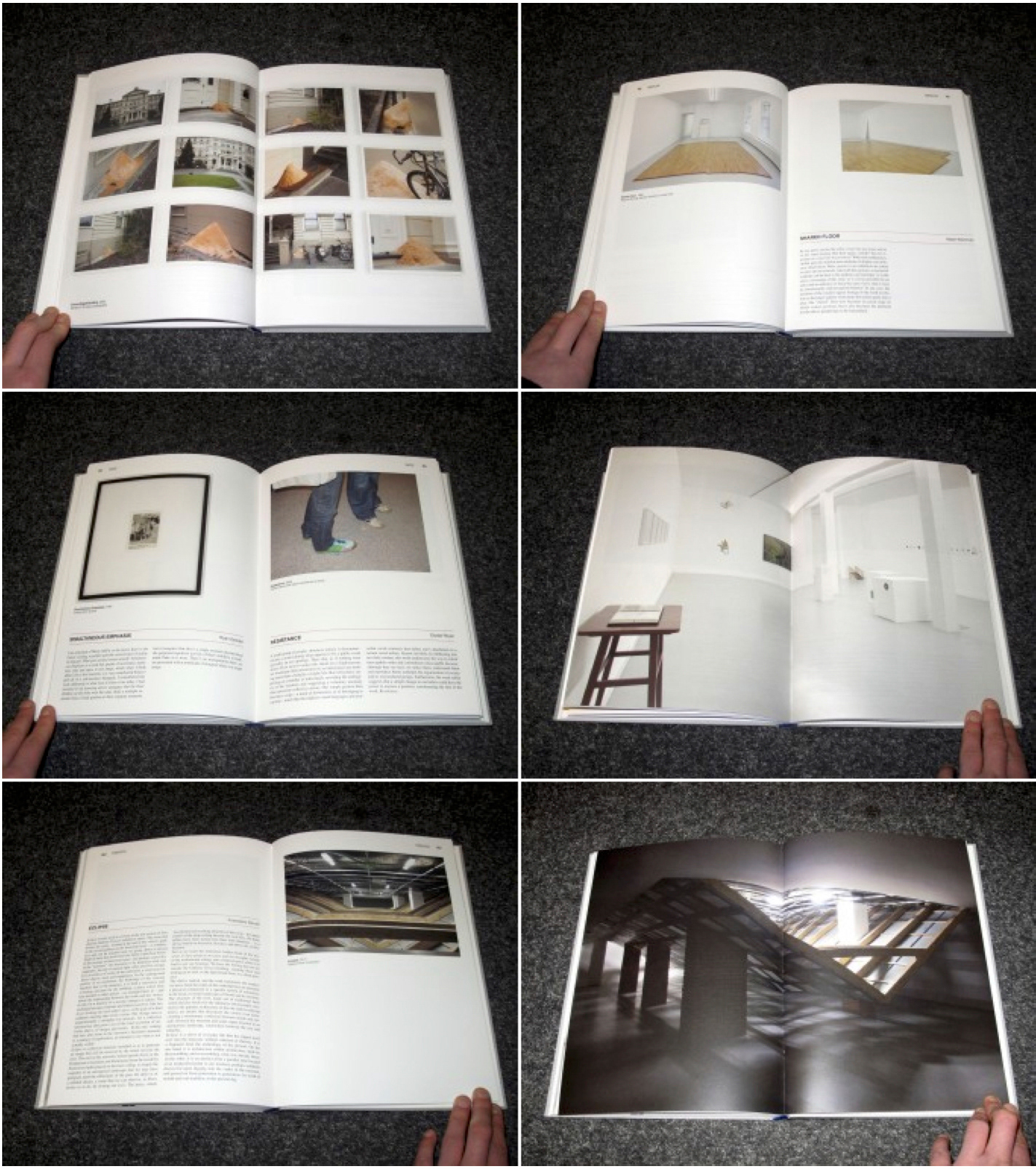
Where we learn to deal with the fusion of text and image as a way to enliven text in a digital age. Print material needs something to sustain continued view vs the motion which imposes its viewing conditions on us. I encourage detail work both as a strategy to reward attention and as a signifier of the concept of celbration/celebrating a concept through decoration.