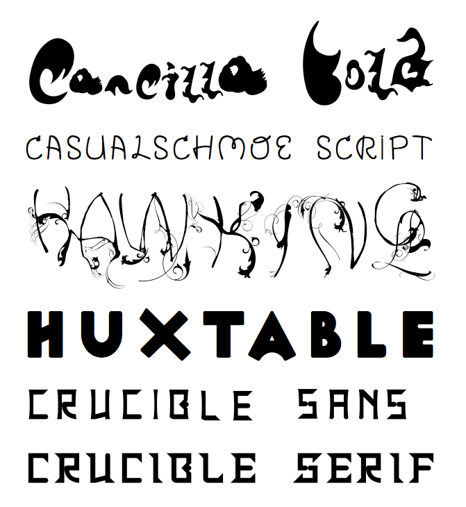

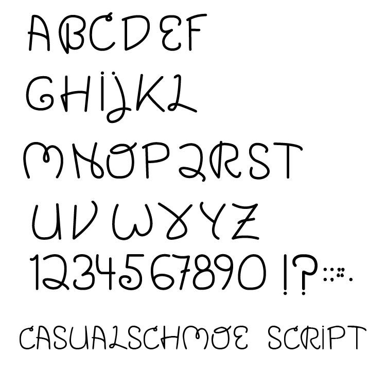
Casualschmoe Script is a typeface based on my handwriting and inspired by Venus Dioxide from the man who eventually became my mentor at Cranbrook, Elliott Earls.

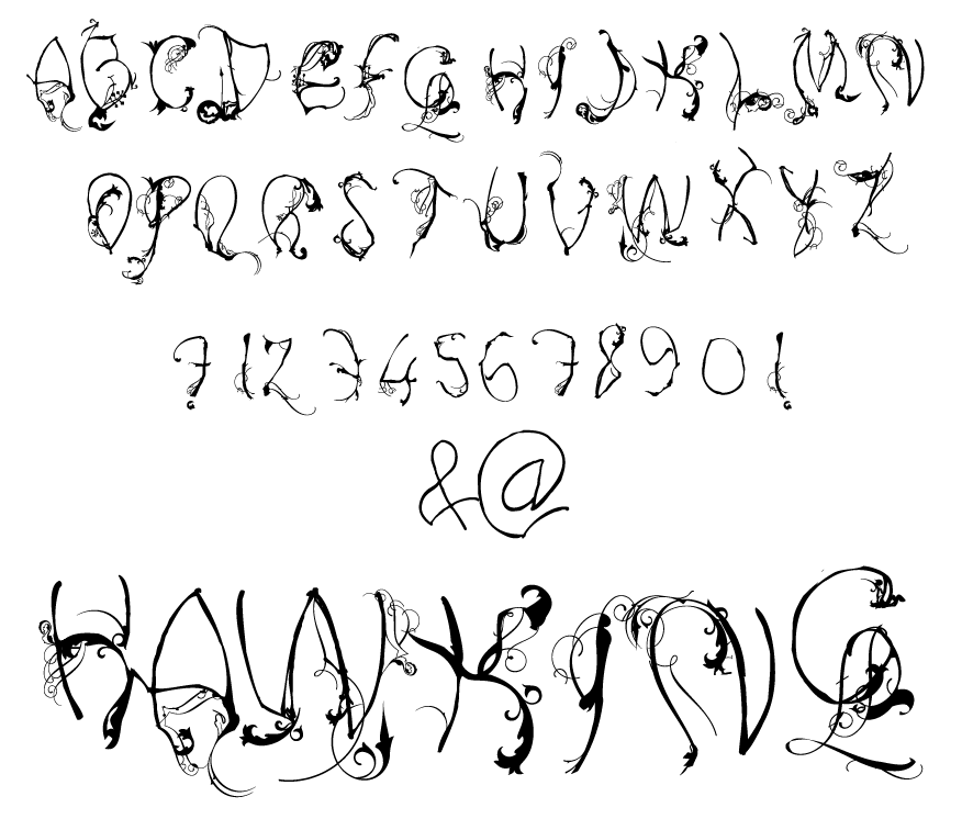
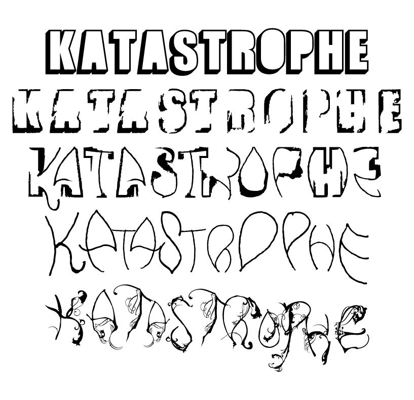
Hawking was a result of a theory of rendering a typeface that evolves over time, the metaphor being a building crumbles and from the debris nature grows and overwhelms. Visually represented as a typeface family that was a rigid, extruded, built font that was printed out: A–Z and then painted over with white out to simulate falling apart before being rescanned and ditgitaly treated to become another typeface. This process was repeated until the skeletal structure of the letter revealed itself and instead of erasing, I began to draw into it and then embellish with fluerons and other decorative pieces from the history of Italian calligraphy. The names of Newton (which is the first) and Hawking (the last) come from different perceptions on the nature of understanding time and the world around us: mechanistic and organic.

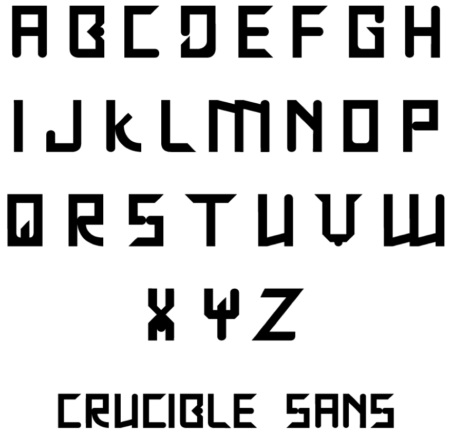
Crucible and Crucible Sans were a result of my studies in the Lindisfarne Gospels and seeing the interesting Irish illuminations there. The typeface itself is built upon a grid and each letter is a combination of rounded and squared off parts. My middle name: "Gavin" depending on whether you look at the Gaelic or the Latin could either refer back to Gawain, the raunchiest knight of Arthur's Round Table or Galahad, the holiest one. I liked this duality and this typeface became representative of that churning sense of dual identities in the chalice, or crucible in which the two would melt into an alloy.
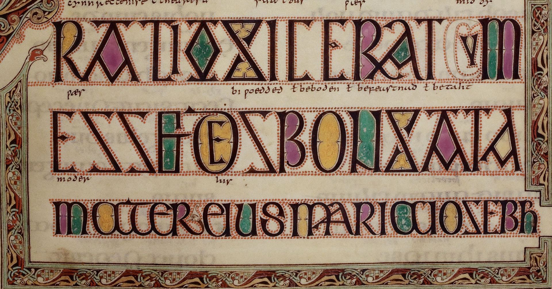
Lindsfarne Gospels, from the Chi-Ro page